
How to make your CTA's irresistible
How to make your CTA's irresistible
Increase clicks by 202%

This post was written just for you.
Did that opening sentence make you more interested?
That’s because personalization really draws people in to see what they have to offer, hoping that it can solve any problem they have (or aren’t even aware of yet).
That’s why social media platforms spend so much time on their algorithms.
Because combining confirmation bias with new information on their interests keeps their dopamine and curiosity levels spiked.
Here’s how to get that effect on your website to increase conversions.
(Thank you to Jeffrey Vocell from Hubspot for studying 330,000 CTAs).
Crush their objections
The most common thing keeping people from purchasing is that there’s still something they’re uncertain about.
A simple CTA like ‘Sign up’ still leaves a lot of questions.
“Will you need to put your credit card in? What if you forget to cancel the free trial before it gets charged?”
Addressing these concerns in the CTA text, or in small text underneath it, can increase your click-through rate (CTR).
Sign up —> Start for free now. No credit card required.
Buy now —> Get x% off now! Cancel anytime
Make it pop
This one goes against conventional wisdom.
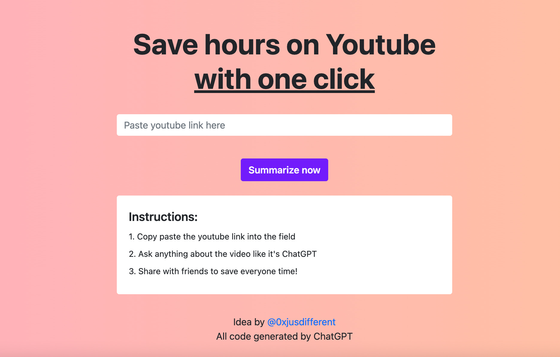
Here’s an old design example of my web app, skipit.ai, where the only purple you’ll see on the website is the ‘Summarize now’ CTA button.
See how much it pops?
If we followed our traditional brand colors, the CTA might have been black, which would be the same as the headline and body text.
Action verbs
Use action verbs related to the outcome they want.
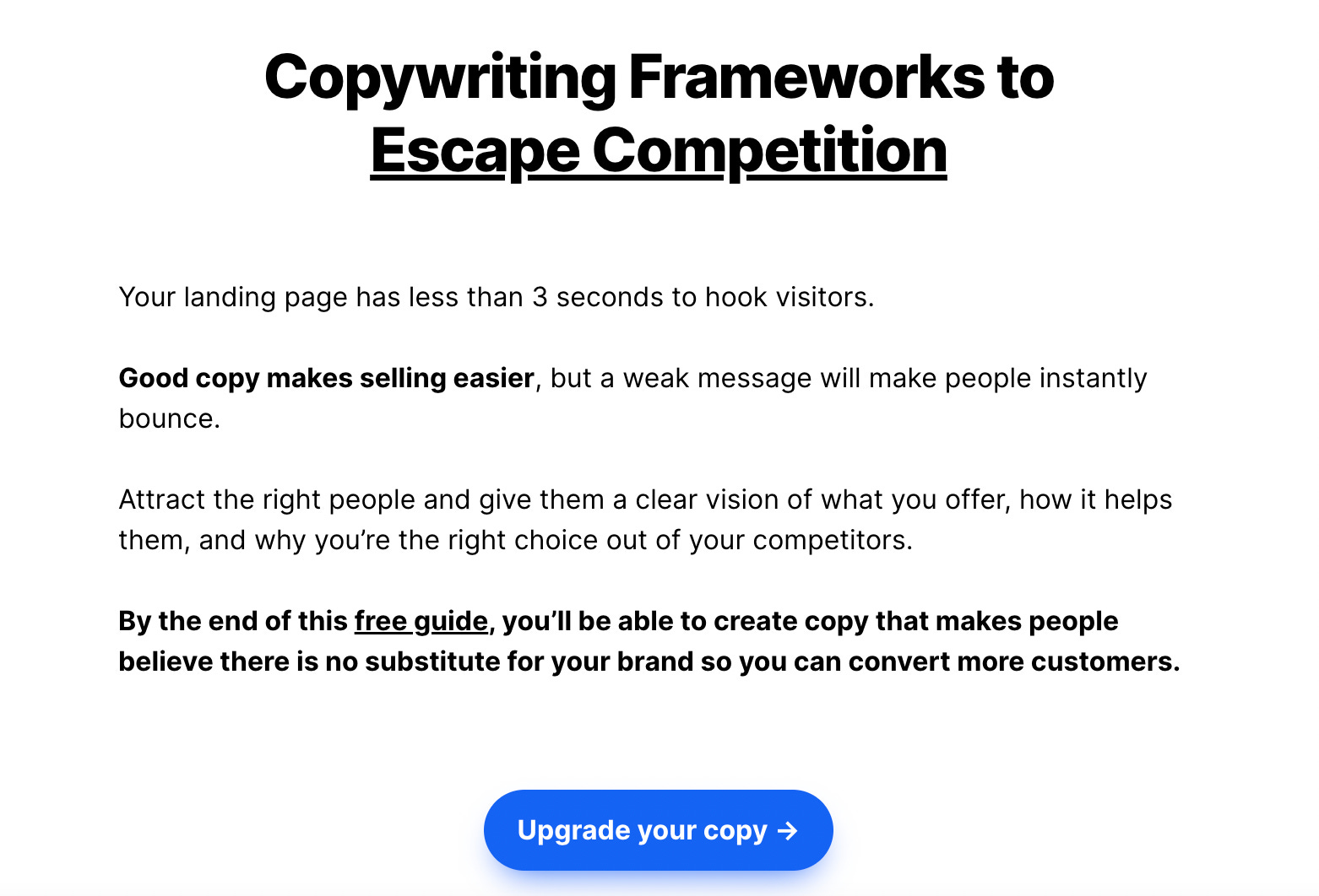
Referencing the image below, which is for a free resource I gave out on Reddit.
Notice the CTA isn’t generic like “Learn more” or “Download now.”
The outcome they want is to upgrade their copy to escape competition in business.
People are already overwhelmed with apps, newsletters, and any other type of offer someone is trying to make quick buck from, so you need to show more value they’ll get up front.
Nobody wants to be first
To dramatically increase clicks, show social proof.
This can be done in the CTA button or in small text underneath.
Try a CTA like “Join 10,000 others” or a small text underneath “Over 10,000 happy customers.”
Another trick is to add a real-time counter under your CTA showing your sign-ups increasing by the second.
This works amazing if you’re already getting traction and have your product being shared organically.
Instant gratification
The most successful products have the quickest time to value.
How quick can someone get a desired outcome from your product so they can tell their friends?
So address this in your CTA.
Again, instead of the generic ‘Learn More’, try ‘Get (outcome) in (short time frame)’
An example can be “Get a new website in 5 minutes” or “Sleep better tonight.”