
How gen-z is ending the trend of minimalist branding
How gen-z is ending the trend of minimalist branding

In recent years, design has forgot about depth and detail and has now become flat and simple.
No outlines, shadows, 3D-ness, and in some cases, no color. Which means no personality, no wow-factor, and no soul.
If branding is showing off your originality, relatability, and exclusivity, then these brands are doing the complete opposite.
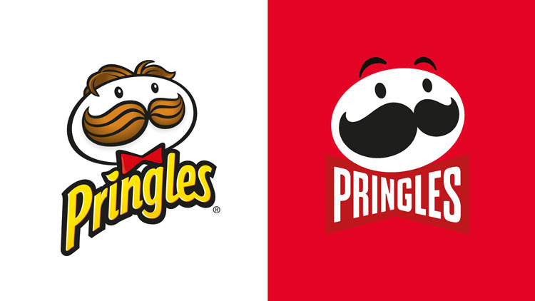
And this isn’t just for tech or fashion brands, even the pringles man had an extreme makeover.
What caused the trend of de-branding?
Several forces at work, with most immediate is pressure of mobile-first design. Flat designs unlock more possibilities for variations, special events, as well as brand and industry crossovers.
Brands remove colors to seem more elegant and upscale.
While trying to show maturity, brands have left their playful innocence and went from cartoonish to corporate, but also from stimulating to bland.
Minimalist logos work really well for things like banks, airlines and companies that need to look universal and reliable. But now the look is getting oversaturated companies using whether it benefits them or not.
But there's a fine line between simplification and soul-less, and most old-school brands crossed it.
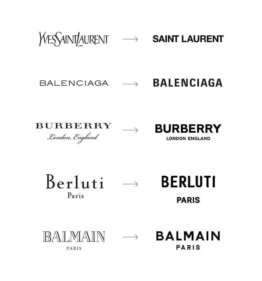
Look how these high-end fashion brands decided to all look the same.
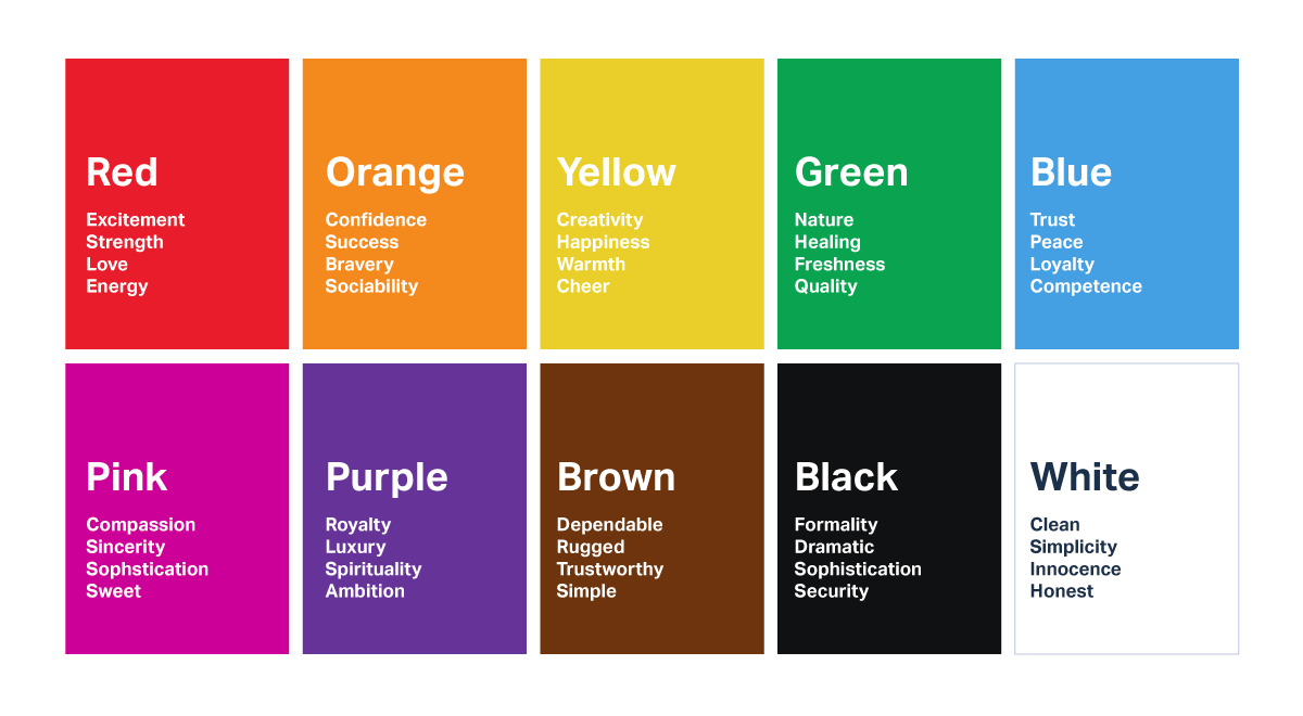
How do brand colors affect us?
Logos introduce your brand at a first glance, with colors associated with certain qualities and emotions, and how you feel about the brand on a subconscious level.
Seems like de-branding will be with us for a while, but what will be the catalyst to have the pendulum swing back the other way?
Zoomer’s need for self-expression
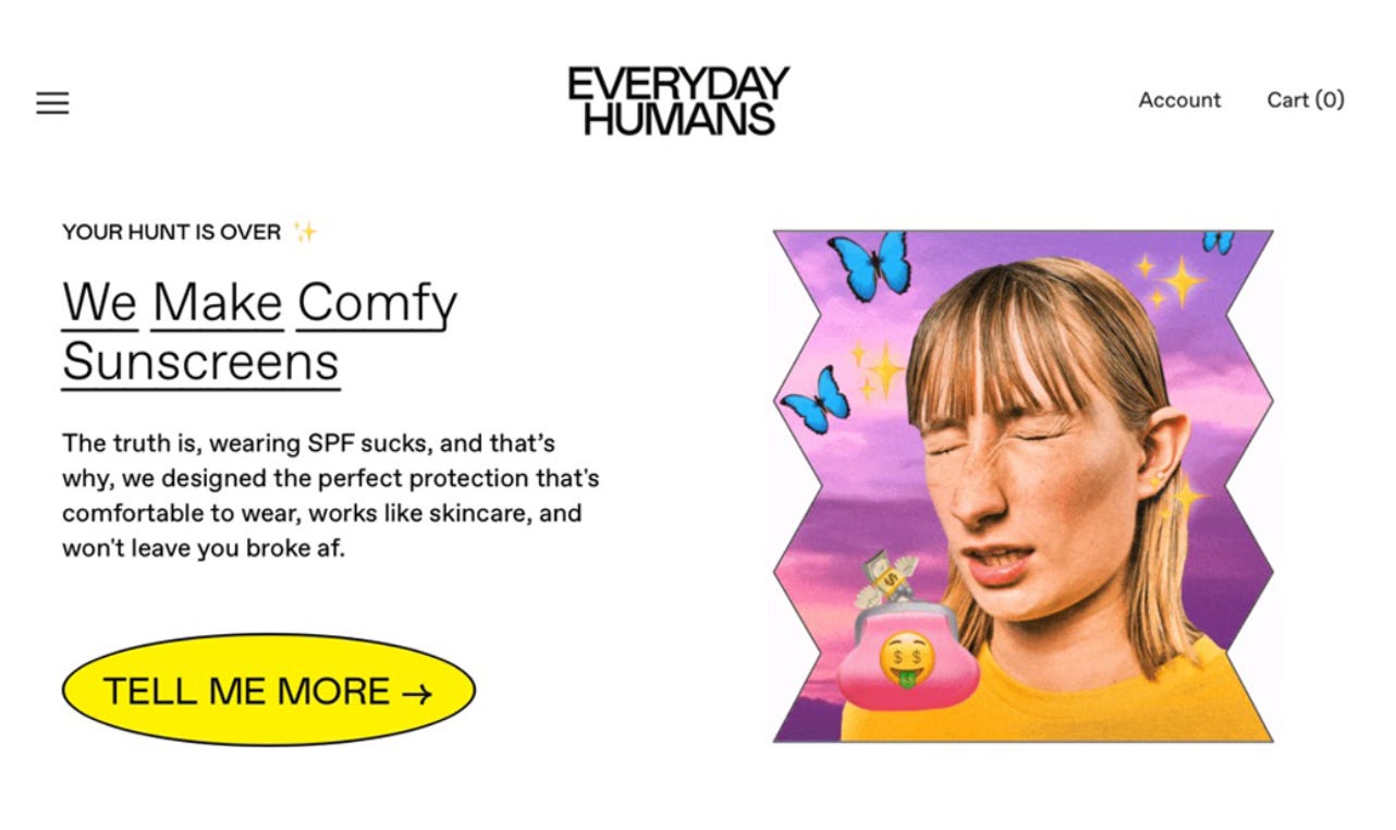
Welcome to the new generation of branding.
Zoomer brands are vibrant, vulnerable, and authentic. Filled with mission statements, brand values, and origin stories. A much needed culture shift from the need of perfection to embracing their insecurities through self-deprecating humor.
They bring personality to boring products, and if you know about Liquid Death's story, you’ll see that this can be a recipe for success.
Their emotional appeal is seen through their tone, typography, and color palette. Their websites are both futuristic and nostalgic, colors vibrant but not too loud, and have a tone of voice inspired by memes.
Highlighting a quirky new generation where their self-expression brings originality.
And as you know, being different is more important than being better.
Zoomer brands truly favor unfiltered and spontaneous creativity over meticulous curation.
They even created their own word for their disruptive brand personality.
Adorkable. dorkily awkward and adorably real.
And if you don’t understand their message, then it just wasn’t meant for you.
So don’t be boring, give your brand a personality.